Creating a cohesive color palette for your home is fun and rewarding. By learning about color coordination and trying out different schemes, you can make a look that shows off your style. Let’s check out some tips for mixing and matching colors for a unified look in your home.
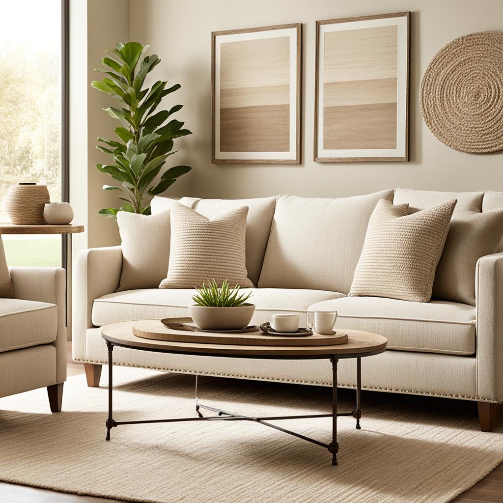
Begin with a solid neutral base in main areas of your home. This sets the stage for adding vibrant living rooms and colorful spots. Use warm woods, clean whites, and beiges as your base. Then, add complementary colors, monochromatic hues, or analogous shades for interest.
Think about the mood you want in your home when picking colors. Cool blues and greens bring calm, while warm oranges and reds add energy. Mixing different styles and textures helps achieve a harmonious look. The key is balance and repeating colors across rooms for a cohesive feel.
As you shape your home’s color, edit your furnishings and decor. Keep what you love and let go of the rest. This makes your home look polished and unified. By following these tips, you’ll get better at mixing and matching colors for a cohesive home.
Understanding Color Theory for Interior Design
Color theory is key in interior design. It’s not just about picking colors; it’s about making a palette that brings unity to your space. Let’s explore the basics of color theory and how it can change your home.
The Color Wheel: Your Guide to Harmonious Combinations
The color wheel is a great tool for color styling. It shows how colors work together. Primary colors – red, yellow, and blue – start it all. Mixing these gives you secondary colors like orange, green, and purple. Then, mixing primary and secondary colors creates tertiary colors.

Primary, Secondary, and Tertiary Colors
Knowing about these color groups is crucial for good color analysis. Primary colors can’t be made from other colors. Secondary colors are from mixing primary colors. Tertiary colors mix primary and secondary colors. This helps you add depth and interest to your colors.
Warm vs. Cool Colors: Creating Balance
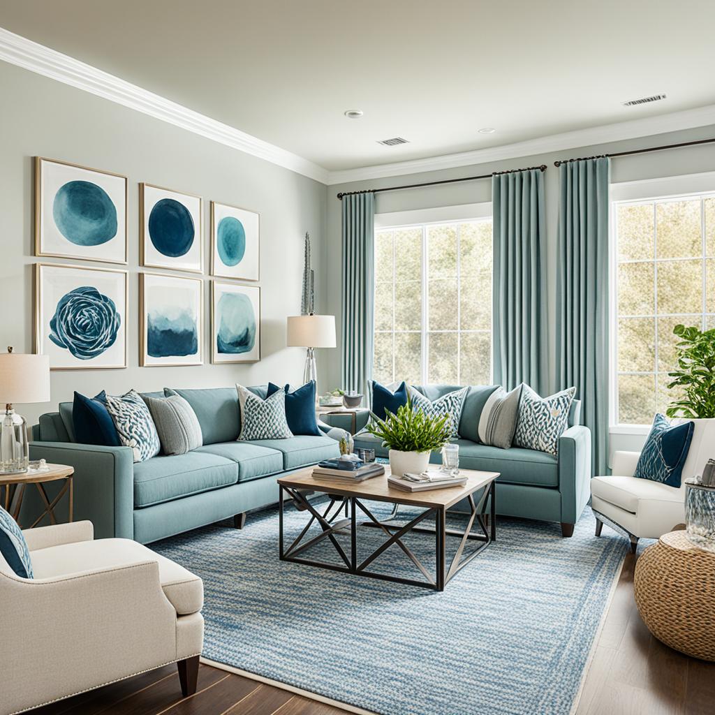
Warm colors like reds, oranges, and yellows add energy. Cool colors such as blues, greens, and purples calm us down. Balancing these changes how we feel in a room. Color psychology is big in how we see spaces.
| Color Category | Examples | Effect on Space |
|---|---|---|
| Warm Colors | Red, Orange, Yellow | Energizing, Cozy |
| Cool Colors | Blue, Green, Purple | Calming, Refreshing |
| Neutral Colors | White, Black, Gray | Balancing, Versatile |
Mastering these color basics will help you create beautiful, unified interiors. You’ll follow the latest color trends and express your style.
Establishing Your Home’s Color Personality

Your home’s color personality shows off your personal style and visual taste. It’s key to making your living spaces look great. Choosing colors for your home is like picking clothes for an outfit, needing careful thought and the right pieces.
Begin by making a style board to see how colors mix. This board helps you pick the right shades, patterns, and textures for your home. It’s like planning an easy, stylish look for your living areas.
| Color Personality | Characteristics | Best Suited For |
|---|---|---|
| Warm and Cozy | Earthy tones, reds, oranges | Traditional homes, rustic interiors |
| Cool and Calming | Blues, greens, purples | Modern spaces, bedrooms |
| Bright and Energetic | Yellows, pinks, vibrant hues | Creative areas, children’s rooms |
| Neutral and Versatile | Beiges, grays, whites | Minimalist designs, open floor plans |
Your home’s color personality should tell a single story. Use the same color scheme in connected rooms for a smooth look. For open floor plans, choose colors that complement or slightly vary your main color to keep things looking connected.
Creating a Solid Neutral Foundation
A neutral palette is key to a harmonious home design. White walls act as a blank canvas, making it easy to add colors later. Let’s dive into how to lay a solid neutral foundation for your space.
Choosing the Right White for Your Walls
Finding the perfect white paint can be a challenge. Think about undertones and how they look in different lights. Cool whites with blue or gray undertones give a crisp, modern look. Warm whites with yellow or beige undertones bring a cozy feel.
Test samples in various spots in your room to see how they change with the light. This helps you pick the best white for your walls.
Incorporating Warm and Cool Neutrals
Adding warm and cool neutrals brings depth to your space. Warm neutrals like beige, taupe, and cream make a room feel welcoming. Cool neutrals such as gray and greige add a sophisticated touch.
Mixing these tones creates visual interest and balance. It makes your home look better.
The Power of Texture in Neutral Spaces
Textured surfaces bring life to monochromatic tones. Use rough textures like wood or stone for a natural look. Soft fabrics add comfort, while glossy finishes provide contrast.
Mixing materials creates tonal variations and visual appeal. This makes your neutral space more interesting.
| Texture Type | Examples | Effect |
|---|---|---|
| Rough | Wood, burlap, stone | Adds warmth and rustic charm |
| Soft | Cotton, wool, velvet | Enhances comfort and coziness |
| Glossy | Glass, polished metal, lacquer | Creates contrast and reflects light |
| Rich | Leather, suede, faux fur | Adds luxury and depth |

By picking the right white walls, blending warm and cool neutrals, and adding varied textures, you’ll set a versatile foundation. This base makes it easy to update and personalize your home as your style changes.
Mix Match Colors Cohesive Look: Techniques and Strategies

Creating a cohesive look with mixed colors takes skill and strategy. Color blocking is a great way to add visual interest. Pairing complementary colors, like a light gray couch with a beige loveseat, creates pleasing contrast and harmony.
Choosing the right color combinations is crucial for interior design. The rule of threes means using odd numbers of colors for better visual appeal. Start with small, colorful accessories to try out different shades. Keep in mind that lighting changes how we see colors, so think about that when picking furniture colors.
To get a cohesive look, use these tips for both your home and your wardrobe. In fashion, the three-color rule means picking a main, secondary, and accent color. This makes outfits balanced and stylish.
Intentional clashing can make a big statement. Try mixing bright colors like magenta, chartreuse, or aubergine with neutrals. The 80/20 rule says use 80% neutral colors and 20% bold ones for a balanced look.
Personal styling is more than just following trends. Find your color personality and try monochromatic or split-complementary schemes. As you get more confident, add more bold combinations to your wardrobe planning.
The aim is to make a look that shows off your style. Whether it’s color blocking in your living room or coordinating your clothes, these tips will help you look cohesive and stylish.
Developing a Cohesive Color Palette Throughout Your Home
Creating a cohesive color palette for your home is essential for a harmonious look. A well-thought-out color story can change your living spaces. It makes them look connected and unified. Let’s see how to make a color palette that ties your home together.
Selecting a Main Color and Complementary Hues
Begin by picking a main color that shows your style. This color will be the base of your home’s palette. Next, choose complementary shades that match well with your main color. Color theory says analogous hues make nice combinations, and complementary colors add bright contrasts.

Using the 60-30-10 Rule for Color Distribution
The 60-30-10 rule is a common guide for color in interior design. Use your main color for 60% of the space. Then, use a secondary color for 30%, and an accent color for 10%. This rule makes a balanced and pleasing color scheme in your home.
Creating Flow with Transitional Colors
Use transitional colors to make moving from one room to another smooth. These colors connect spaces well. Think about using lighter shades of your main color or neutral tones for a cohesive look. Remember, having consistent color undertones in different spaces is important for a smooth transition.
By following these tips, you can make a cohesive color palette for your home. This approach ensures a harmonious look while keeping each room unique.
Balancing Color and Pattern in Different Rooms

Making your home look good means mixing patterns and colors well. Use fashion styling tips for your home to make a smooth look from room to room. Create a home wardrobe palette that connects everything.
Experts say pick one color as a theme for all rooms. This keeps things unified but lets each room have its own color vibe. Stick to two or three colors used in different ways to keep the look flowing.
When mixing prints, use different sizes and styles to keep it exciting. For example, pair a big floral with a small geometric in matching colors. This makes your spaces more interesting.
Color harmony is key to balancing different rooms. Use similar colors to make a smooth transition between spaces. For rooms with different colors, use flooring or rugs that have both colors to connect them.
- Use woodwork as a unifying element by repeating the same color or finish on baseboards, door frames, and moldings
- Paint all trim throughout the house in the same shade of white for a cohesive feel
- Incorporate accessories to introduce bold colors without overwhelming the space
Lighting changes how we see colors. Choose similar colors and lighter shades for sunny areas for a bright look. By balancing color and pattern across rooms, you’ll make your home look cohesive and stylish.
Incorporating Accent Colors and Statement Pieces
Adding accent hues and statement pieces can make your home vibrant and personal. By picking bold colors and unique items, you can add interest while keeping your rooms looking unified.
Using Artwork to Introduce Bold Colors
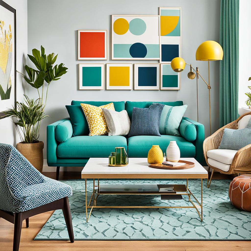
Artwork is a great way to add bold colors to your space. A striking painting or photo can be the main focus, guiding your room’s color theme. Pick pieces that match your decor but also add a splash of color. This lets you try out living room color ideas without making big changes.
Colorful Textiles: Pillows, Rugs, and Curtains
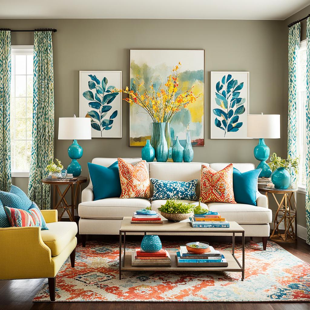
Textiles are a flexible way to add colorful accents. Throw pillows, rugs, and curtains can quickly make a neutral space lively. Mix different patterns and textures for depth and interest. Use the 70/20/10 rule for colors: 70% main color, 20% secondary color, and 10% accent color.

The Impact of Colored Furniture and Accessories
Colored furniture can be eye-catching statement pieces in your room. A bold-colored sofa or chair can anchor your space and set the design’s tone. Add smaller items like vases, lamps, or decorative objects in matching colors to tie everything together.
| Element | Impact | Examples |
|---|---|---|
| Artwork | Introduces bold colors | Paintings, photographs, sculptures |
| Textiles | Adds texture and color | Pillows, rugs, curtains |
| Furniture | Creates focal points | Colored sofas, armchairs, sideboards |
| Accessories | Enhances overall scheme | Vases, lamps, decorative objects |
Lighting and Its Effect on Color Perception
Lighting design is key to how we see colors at home. The right mix of different lights can change a room’s look and feel. Natural light shifts during the day, changing how colors look in our spaces.
Color temperature, measured in kelvins (K), affects how we see colors. Warm lights under 3000K make cool colors like blues and greens look softer. On the other hand, cool lights over 4000K can make warm colors like reds and oranges less vibrant. For the best color accuracy, like when showing off artwork, go for a 3000K temperature.
To add depth and interest, mix your lighting types. Use ambient lighting for overall light, task lighting for specific tasks, and accent lighting to spotlight features or art. Art lighting should be about 25% brighter than the overall light to make art stand out. Dimmers let you change the mood and look of your space easily during the day.
